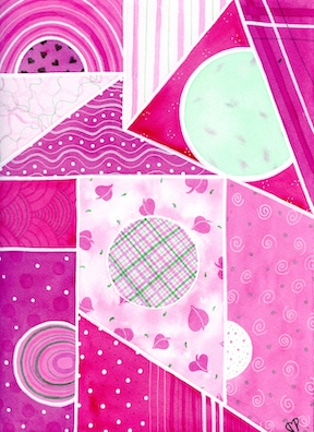
Hello! Today’s painting topic is the piece called “Fuchsia” and it’s pretty obvious why I named it that! Hot pink is probably my favorite color and when I look up what it represents, Google says it’s energy, boldness, and playfulness associated with youth, confidence, and self-expression. I think that’s a pretty accurate description for how it makes me feel, energy-wise. How are people saying it nowadays-it raises my vibrations and makes me feel happy and youthful.
If you would rather watch a video talking about the art instead of reading, you can see it here: https://youtu.be/Gywq_Jeaj1w
I started as I normally do, intuitively creating my boundary lines and spaces with a light pencil, and then added the masking fluid over the top of them. It’s so funny that I chose the color palette on Christmas Eve, but I did. I’m not much into pink for the holidays, as I explained in my last video, but the reds and green of Christmas inspired me to change up their hues, going with a myriad of pinks and greens. The palette colors made me happy and reminded me of ice cream, but also the 1980’s. I remember wearing these colors together, pink and green as well as light pink and grey. Just an FYI, the computer shows it a bit brighter than it is in real life.
I feel like my focal point in the composition fell flat, but I do enjoy how the patterns actually do draw my eyes around the canvas. Another thing that pleased me was the texture in the watercolor washes. I started to put more color at one corner or added paint by plopping it into a space in a wet-on-wet style, rather than fighting for the flat wash. Per usual I created the odd number of circular images and actually emphasized them with the patterns flowing around them. The circular lines in the top and bottom left side spaces shift in direction with the middle rainbow style line work which causes a really cool effect. The line pattern on the upper right triangle and the bottom center triangle make a good balance and are also super pleasing to my eye. The minty green with faded splashes of pink are pretty mesmerizing and keep drawing my eye. It’s probably the giant color contrast, but even though it is a contrast, it’s soothing.
I love the leafy shapes in the central quadrilateral, but the plaid is where I feel the focus fell flat. I like the plaid, I just think I could have located it better. If I were to do the piece over, I would make the circle a larger leaf or some other vignette and put the plaid to the outskirts, rather than making it central. But this is how I learn, by exploring and making some decisions that don’t always work out the best. Overall, I’m really happy with the piece and think I got really saturated colors with the Daniel Smiths I used.
A funny thing about the name of the piece, “Fuchsia,” was also a struggle and learning moment because I misspelled the word. To me, it makes no sense that the ch come before the s, because reading that looks like the pronunciation should be “fe-u-k-sa” or “fe-u-ch-sa.” For YEARS I have put the s before the ch because I felt like that softened the ch to an sh sound, and even submitted it to a critique with that wrong spelling! The English language is so fluid and ever-changing. Change can be really hard for me, but sometimes I can adapt easy too. I’m happy to report I have it down now! FEE-UUUU-SSSSHHHH-AAAA!
Well, that’s all I’ve got for today. I hope you enjoy this art piece!

