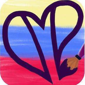
In this piece of Autistic Expressionism I had received a new watercolor travel palette and was super excited to use it. Since then I went through an obsessive phase of buying and trying out new collections of colors because every person or company who creates paint has recipes for their own colors. Rarely do colors match from one company to another, but these mini palettes often have coordinating colors that go really well together. I have no problem mixing my own colors, but having determined that I was going to use a limited palette, these small collections are useful in case I don’t mix enough of a color. Plus, I don’t have all color mixing combinations memorized so having a swatch card to look at (this is a piece of paper I keep in each palette that shows the colors) helps me have easy access to the colors I actually want to use.
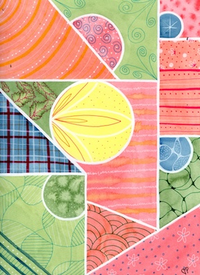
I intentionally created larger shapes in this piece, making an effort to add triangles. You’ll see in the center the shape around the central circle is an odd one, more than just the lines and circles I had been using up until this point. I also felt like playing with the watercolors so I was dripping paint in paint and water in paint. I also used paint in a different line structure than I previously had which I really enjoyed as it looks a bit like energy. I feel like this piece has a lot of energetic patterns, from lines with dots on them, to ziggly lines, to curving crossovers.
In my last video I talked about drawing intersecting lines and then putting miniature patterns in them. In this piece I really curved those lines and added other colors into these patterns and I played with it in several locations around the paper. This is one more step toward what has become a staple pattern in my more recent works. My feelings were a bit on the joyful side, which is why I made the springy lines at the top and also the bright color palette. Having begun to make sure I have a central focus, I used yellow as the base in only that location. It’s a lighter and brighter color than the rest and draws the eye. I really enjoy this central circle. The petals inside each other are OCD pleasing for me and the dots add a juxtaposition that calms the points. I haven’t done a flower like this since, and that makes it one-of-a-kind and special. My signature rainbow lines are in this piece and the color is well balanced if a little cooler on the left than the right side when looking at the artwork.
I named it “Raspberry Buds” because the water patterns in the paint made leaf looking shapes that resemble raspberry leaves and also the pink feels like a really raspberry color to me.
If you’d like to watch a vlog about this artwork, click here: https://youtu.be/ahzYX197MT0
Thanks for reading and learning about my art. God bless you!
Dawn
