
I wanted to share this piece of art I made in Autistic Expressionism because the color palette is something so different from colors I normally work in, and if you’d rather watch about it than read about it, go here: https://youtu.be/YbzRvmue__k
Traditionally and well into my twenties, I always thought of Christmas colors as red, green, and gold for home and tree decor. In 2012, we had moved to California for a six month tour and so we put most of our household items, including our Christmas decorations into storage. As we neared the end of the six months in California, my husband received orders to stay there for another year, and Christmas was coming and I had no Christmas decorations.
Well, I couldn’t go without celebrating as this holiday has always meant so much to me about love and family, and of course Jesus, and the hope that He brings, and I wasn’t about to not celebrate that year so we opted to purchase a small fake pine tree in a pot to put our gifts under. I then bought rolls of navy and white sparkly yarn so I could crochet garlands for the tree, white poinsettias, and silver snowflakes to decorate it. I absolutely loved adding white (which is definitely a winter color-though not in California), blue, and silver to expand my Christmas color repertoire. I’m still not a fan of pinks, oranges, or yellows for Christmas, but I also don’t think it’s that important nowadays.
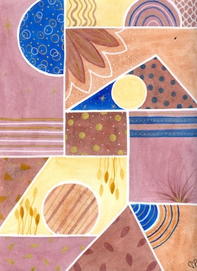
Now, for some reason when I sat down to my art time two days before last Christmas, I began reminiscing about my decor over past Christmases while I stared at my current Christmas tree which was decked out in Buffalo red and black plaid. As I was trying to determine the color palette for this next art piece, I saw a new nativity scene ornament I had just purchased when on a trip a couple of months before and it started me thinking about the desert and the night sky. I’ve used dark blue fairly often over the past few years in other paintings, mostly for night skies, and it can really pack a punch so I decided to use it as my accent color. Midnight blue was my favorite color in the big box of crayons as a kid, so that was my first color choice.
When I started watercoloring a few years ago, I created my first palette with a mix of Winsor-Newton and Grumbacher paints based on the instructor’s preferences from lessons I was taking at the time. I still like that palette, but now I rarely pull it out because my favorite paints have become Daniel Smith watercolors. I have two palettes, a cool and a warm, which have become my “regular” paint set (though now I’ve added a third, plus have become a watercolor paint set hoarder with tons of brands and types of watercolors). After I chose my midnight blue from the cool palette, I decided that since I didn’t use my warm browns very often, it would be a chance to use them, so then my desert palette was determined.
I created my spaces as I normally do with a ruler and a circle template, again making sure to have an odd number of circular shapes, balanced throughout the paper. I can’t say I was having any particular emotions I needed to process, even though my mind is always going 100mph, I was more concerned about getting into the studio as part of my daily routine. Once the palette was determined, I got my Christmas music going, started painting, and my mind reverted to the nativity scene ornament. This led down a path of memories of the many nativity scenes I’ve collected over the years, but it was a bit strange how the color choices kept bringing me back to the desert, and thinking about a teenage Mary and a young Joseph on their way to Bethlehem to register for the census. Intermixed with the Christmas story, were images of a little drummer boy walking through the desert as well.
I started with my normal dots and lines, then began to add stars in the night sky as I thought about the North star and the Magi, desert-type fronds, wheat-type plants for a Joseph from a different Bible story in Egypt, then wavy lines to represent the Nile and scales to represent fish. I really got into the marking of this piece and added white and gold accents as a festive touch. When I was finished, I loved it. I am not normally a browns and golds fan, but the granulation of these paints really added texture and coordinated so well together, and I was right in my estimation of how the blue would contrast well against them.
This piece is not conventional, but as always, every time I created a new pattern, a rampant thought shut down in my mind. Processing Christmas memories and contemplating the time 2000 years ago made me feel calm and content and full of love. I hope you enjoy this piece as much as I did and do.
Thanks for reading, and if you’d like to know when Dawn’s next blog and vlog are available, sign up for her email updates here: https://mailchi.mp/8e630fb4517c/dmpaulart
Dawn

Beautiful, Dawn.
LikeLike
Thanks, Marianne! I appreciate it.
LikeLiked by 1 person